

1 While working with Studio, we discovered a few “imperfections”. For example, in bar charts, the value of one section is written to the next section. For a better understanding, here is an example:
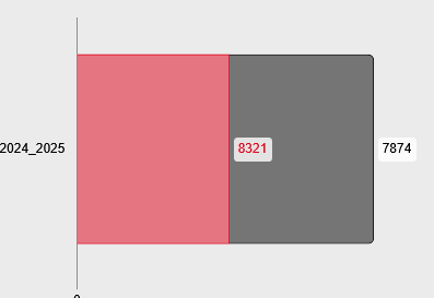
The red area shows the number of men, the gray area the number of women. However, the number of men is written in the women's block. Couldn't this be placed in the men's block?
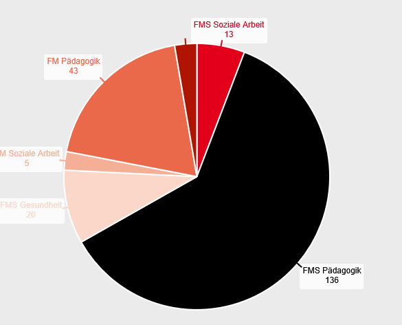
2 The doughnuts (and also the diagrams) are also somewhat unsightly. Certain labels are only displayed when the cursor is moved over them, even if there is actually enough space for a ‘permanent’ label:

or
3 For charts, a subtitle is mandatory as soon as you select the variant with title and data labels. Could this not be set to optional?